

ATM Withdrawal
A comprehensive overview of the design process for the U.S Bank ATM Withdrawal experience.
My Role
User Experience Designer
Core responsibilities
Wireframes
UI design
Interaction design
User flows
Prototyping
Overview
Context
U.S. Bank is the fifth-largest commercial bank, with over 2,000 branches in 26 states and a digital footprint worldwide. 4600+ ATMs with five different model lines. In 2022, an initiative was established to completely overhaul the ATM's older hardware and software.
Integrating a new third-party software called Middleware presented an opportunity for new features for users and business lines. The initiative was comprehensive and covered every aspect of the ATM's user experience. This case study focuses on the Cash Withdrawal process and its related flows and experiences.
Overview
Business Goals

Enhance Customer Self-Service Capabilities
Transition transactions from teller-assisted to self-service at ATMs, reducing the need for in-branch personnel and increasing operational efficiency.
Increase Transaction Efficiency
and Accessibility
Streamline transaction flows, reduce the number of clicks, and ensure compliance with accessibility standards, making it quicker and easier for all users, including those with disabilities, to complete their transactions.

Modernize and Standardize
the ATM Experience
Update outdated ATM models with new hardware and software to ensure a consistent, modern, and user-friendly experience across the entire fleet, aligning with industry standards and customer expectations.
Overview
Target Audience

U.S. Bank Customers:
Regular customers who use ATMs for various banking transactions such as withdrawals, deposits, transfers, and account management.
Credit card holders who need a convenient way to make payments, especially those without a demand deposit account.
Non-U.S. Bank Customers:
Individuals who may not have an account with U.S. Bank but use its ATMs for transactions, representing about 25% of the monthly ATM transactions.
Accessibility-Conscious Users:
Users with disabilities, particularly those who require wheelchair-accessible ATMs, ensuring they can easily reach and interact with critical on-screen elements.
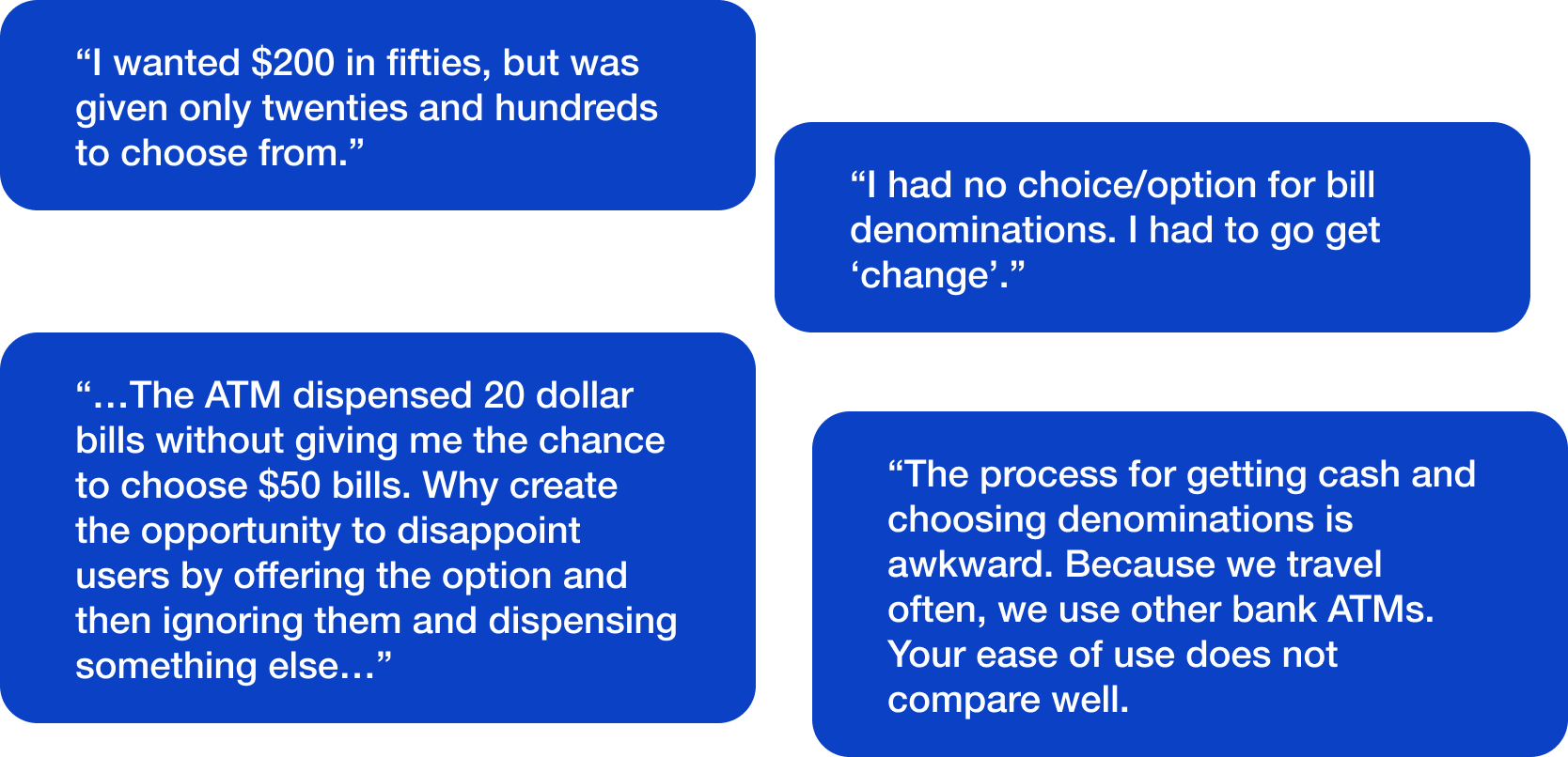
Metrics and Customer Surveys
The primary driver for updating the withdrawal flow was user feedback from customer surveys. The overall theme was that the withdrawal experience needed to be clarified. Users could not predict what bill they would get or if they would get the option to choose, which led to reduced satisfaction.
Overview
When users think about the ATM experience, they don’t only think of the user interface; they also think about their banking experience as
a whole. This includes the ATM location, unexpected functionality, or hardware errors like low or no cash, etc. Many of these issues are outside of the purview of ATM UX, but the KPI is affected by the users' grade for the whole U.S. Bank experience.
Parsing the user feedback
Analysis
Experience Analysis

I conducted a full audit of the production experience, previous versions of the withdrawal flow, and competitor solutions to determine what aspects of the U.S bank ATM experience could be enhanced, updated, or reworked.
Accessibility line
The ADA (Americans with Disabilities Act) provides guidance for accessibility for disabled users. This includes ensuring that content is reachable for wheelchair users. After reviewing the screens, I noticed that the experience didn’t adhere to the defined areas of the screen.
Analysis
Choose an Amount

To proceed from the “choose your amount...” screen, the users had to take two actions: the first was selecting the withdrawal amount, and the second was selecting either “Choose bills” or “Get cash.” Based on user feedback, these options led to confusion and unintended results. Some users who wanted a different bill mix would select “Get cash,” not knowing they would not be allowed to do so in that flow.
Conversely, users who selected “Choose bills” would be prompted by another screen, slowing down their transaction completion time.

Previous ATM Experience
In a previous iteration of the ATM, there were dedicated buttons for “ Smaller bills,” “Only $20 bill,” “Larger bills,” and “Reset bills.” this iteration wasn’t a perfect solution for the users they could not specify which bills, other than “Only $20 bills”.
Competitive analysis
Bank of America

Bank of America uses a fairly sparse interface for its choose your bill screen. One callout is that BofA does not prioritize Accessibility, with the selection buttons being out of reach for most wheelchair users. That said, the total amount is prominent and clear to read. There is also an autofill option, “Pick for me.”
Chase
Competitive analysis

The main difference in design for Chase’s “Choose bills” screen is how the total amount is displayed. There is a line item of “total” that lists the current amount added and the total amount requested, in this case, “$0 of $20.” Also, the largest denomination is listed at the top of the list versus having the amounts go from smallest to largest.
Competitive analysis
PNC Bank

PNC has similar information but displays it differently than the other. Firstly, there are headers for the “Number of Bills” and “$ Total Bills” columns. Also, the “Number of Bills” and “$ Total Bills” have been aligned to show the relationship to each other.
Design process
Design Iteration

With examples from the U.S. Bank production user interface, previous designs, and competitors, I started to iterate on potential designs. A primary goal in all iterations was to ensure that the experience was accessible, meaning that the interaction area would be limited to below the lower third of the screen.
Withdrawal User Flow
Design process
With support from the development team, I outlined the user flow and the technical dependencies to identify areas for improvement.
Choose an amount simplified.
Design process
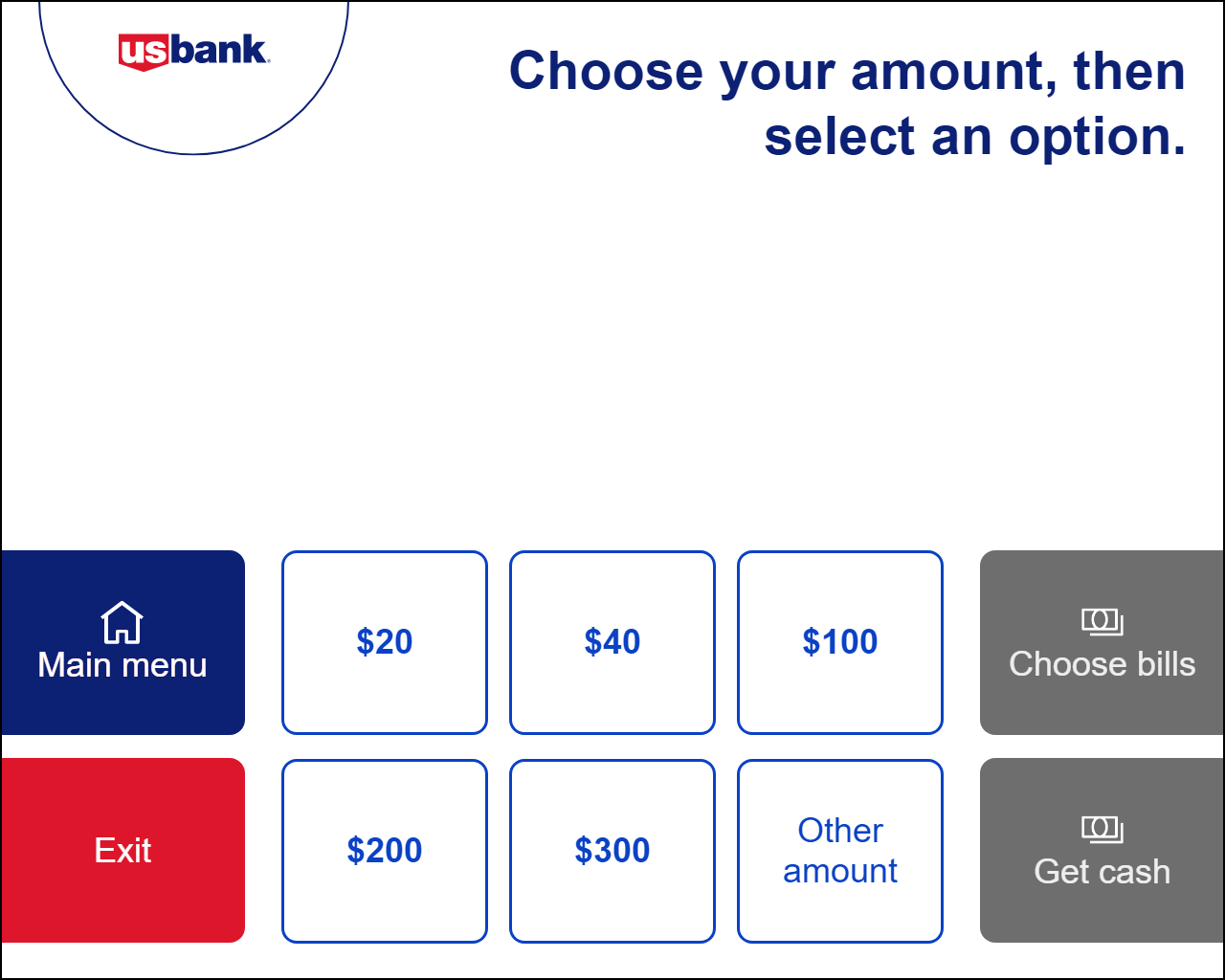
The main goal was to simplify the process and remove the distinction of choosing bills or getting cash. This allowed for adding more preset denominations and streamlining the flow.
Design process
Other Amount Iterations

With the choose amount screen finalized, I could move on to the Other amount screen, where two primary issues needed to be addressed. The first issue in the production experience was that users did not have the ability to go back to the previous screen in the flow. You could only choose an option or reset the transaction by going to the Main menu. The second issue was that the experience moved away from two options, so I needed to update the way the users moved forward in the transaction.
Design process
First Iterations

The first iteration for the other amount was a minor update to the production design, updating the content and the button color after reviewing it with the Accessibility (A11Y) team. The feedback was the prominences of the “Clear Button,” and the use of color as the only differentiation could be adjusted to make the action more clearer to the users.
Design process
Second Iterations

With the feedback from A11Y, the “Clear” button was minimized and updated with an icon for clarity also the center-aligned buttons were moved to the right side of the screen to better show the direction the user should take.
Final Other amount.
Design process

The final Iterations of the text are to the left for better readability. Also, the “Use multiples of…” content was added back, and the button text for “Get cash” was updated to “Enter” for clarity in the process.
Design process
Bill Mix Iteration

The primary focus was defining the best way for the user to obtain the bills they want for the transaction.

Design process
Low fidelity mockups
After reviewing all of the experiences in the competitive analysis, I began to outline some solutions for the “Choose your bills” screen.
The first concept added buttons to the UI for for either large bills or only $20. While working with the development team, it was mentioned that to make the screens work in Accessibility Mode, there could only be nine interactive buttons on any screen.

Design process
Refined Design
With the development team's work on the backend, I was able to design a version of the UI that automatically populates the most common bill denominations for any set withdrawal amount.

Design process
Final Bill Mix
After input from A11Y, I updated the design by increasing the size of the plus and minus buttons to facilitate disabled users' access and removing the money icons for clarity.
Research
User Research

After reviewing and finalizing the design, I created an interactive prototype for a usability study. I also partnered with the research team to develop the study's success criteria.
Research
Objectives

Evaluating Withdrawal Efficiency
Assessing the speed and ease with which users can complete withdrawal transactions at the ATM.
Assessing User Success in Withdrawing Cash in Different Denominations
Measuring users’ ability to select and withdraw cash in various denominations based on their needs.
Testing the Clarity of Call-to-Actions (CTAs)
Determining whether users understand the on-screen instructions and calls-to-action during ATM transactions.
Research
Key Evaluations

1. Easy to use
2. Easy to complete
3. Speed to complete task
4. Easy to understand the process
(Ratings are based on a scale of 1 - 5; 5 = Very easy and 1=Very difficult)
Research Task
Withdrawing $100 cash when prepopulated.

All users found withdrawing $100 cash when prepopulated was easy to use.
"Very easy and quick"
"The longest part was changing the bills, if I actually wanted to do that"
"This process involves more steps"
"Didn't see a fast withdraw button"
User scores
Easy to use: 5.0
Ease of completion: 5.0
Speed: 4.5
Easy to Understand 4.5
Research Task
Changing prepopulated bills denominations.

Participants expect the system to auto-calculate different bill denominations.
Users found changing the dollar denominations easy; however, they would like the option not to reduce the $20 first before changing the bill denominations.
"It was quick and not complicated at all"
"The $20 was preselected and it took me a second to figure out to change the $20 to 0 and select the bills I wanted "
"I think it should auto-adjust. So, I choose 1 increment of $5, the $20 should clear. I had to manually reduce the $20 count from 1 to
User scores
Easy to use: 4.5
Ease of completion: 4.7
Speed: 4.5
Easy to Understand 4.7
Learnings
Key Takeaways
Overall, the feedback in usability testing was positive and validated the updated experience, which helped to move the ATM into a pilot launch to get more user feedback with a national launch in Q1 2025. The next step for the withdrawal experience will be testing a flexible withdrawal process where the user can select as little or as much (up to their daily limit) without preselecting a set amount.