Context
The old screen forced a choice between “Choose bills” and “Get cash,” two paths most users couldn’t tell apart. Accessibility mode caps any screen at nine interactive elements. This is how I simplified it.
U.S. Bank is the fifth-largest commercial bank: 2,000+ branches, 26 states, 4,600+ ATMs across five model lines. About 25% of monthly ATM transactions come from non-U.S. Bank customers. In 2022 the company began overhauling the whole ATM experience; this write-up covers the Cash Withdrawal flow.
What customers were saying
The primary driver for the update was survey feedback. The theme was consistent: users couldn’t predict what bill they’d get or whether they’d have the option to choose.
When people think about the ATM experience, they don’t separate the UI from everything else: location, hardware errors, low cash. Many of those are outside UX, but the KPI doesn’t care.
Experience analysis
I audited the production experience, previous versions of the withdrawal flow, and competitor solutions. One early finding: the screens didn’t hold to the ADA-defined reach zones for wheelchair users. Interactive elements sat where some users physically couldn’t tap them. From that point on, every iteration followed a single rule: keep the interaction area in the lower third of the screen.
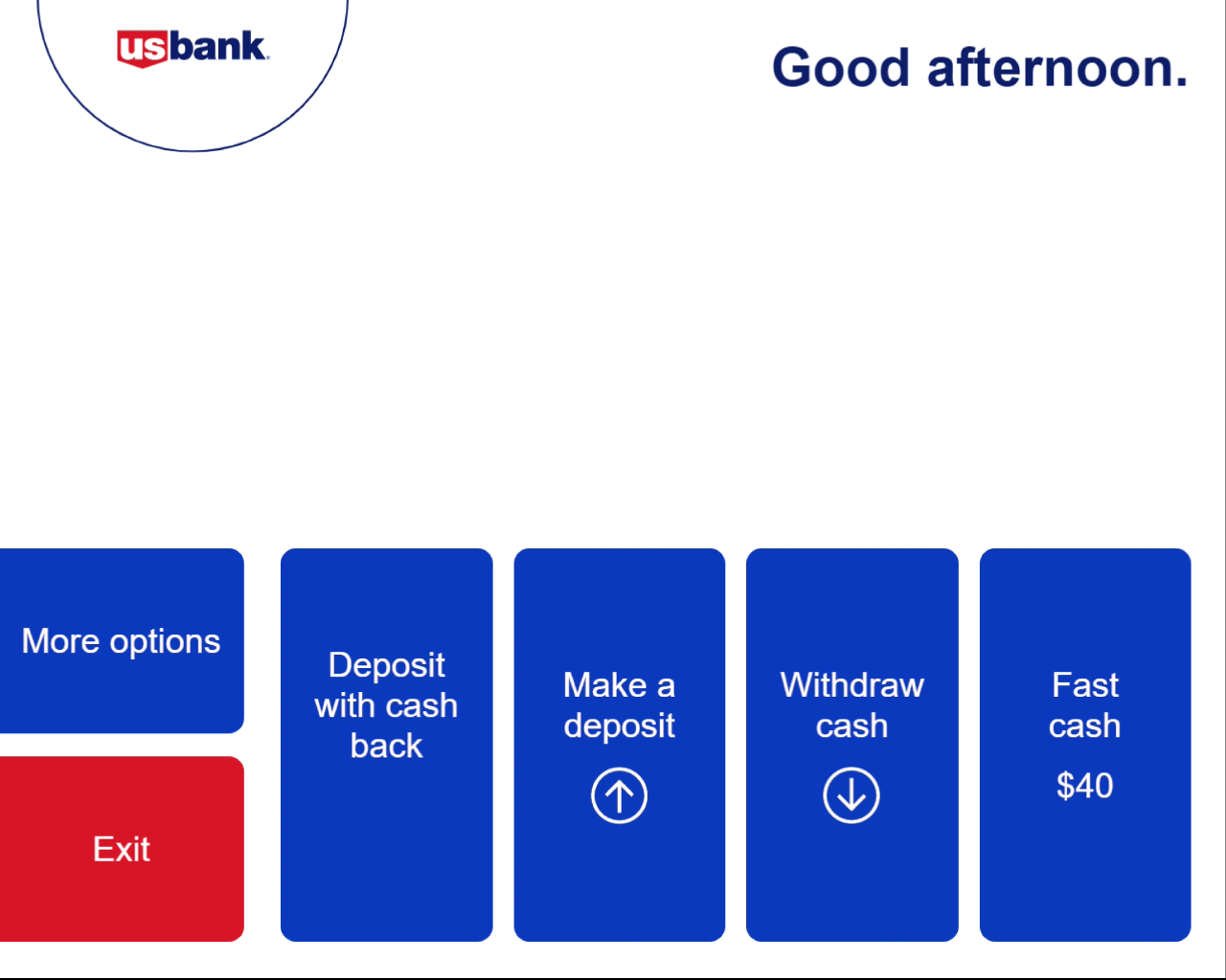
The old choose-amount screen
To move forward from “choose your amount,” users took two actions: pick the withdrawal amount, then choose either “Choose bills” or “Get cash.” The options led to unintended results. Some users who wanted a different bill mix picked “Get cash,” not knowing that path wouldn’t let them choose bills at all.
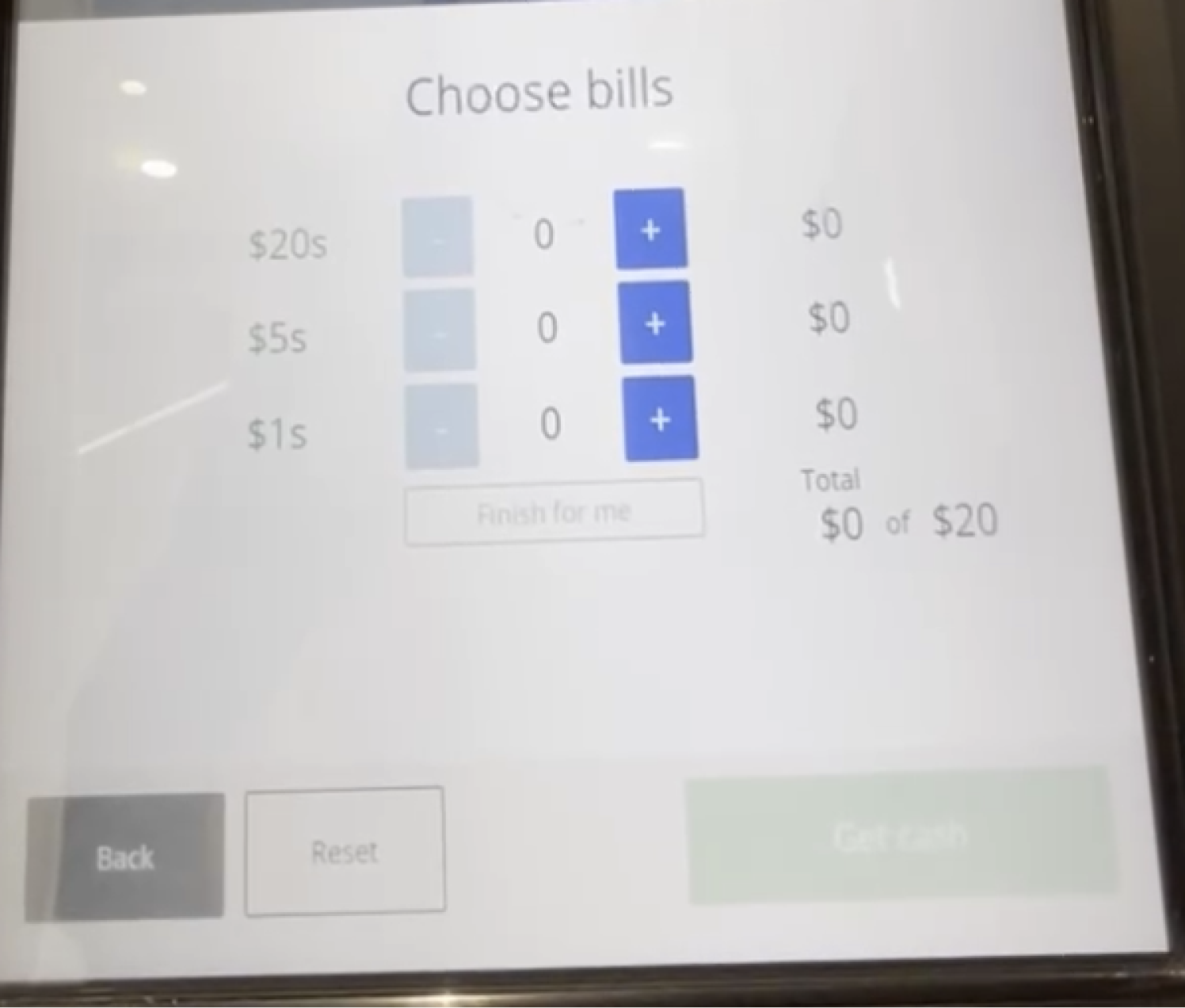
The other path wasn’t better. Users who selected “Choose bills” hit another screen that slowed them down.

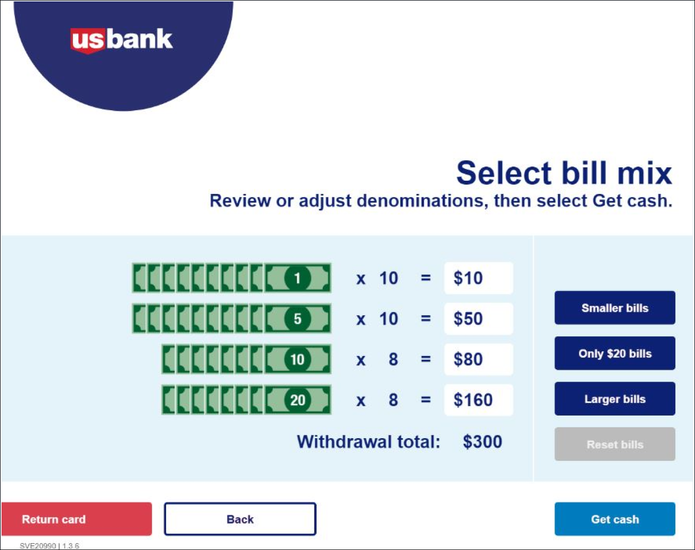
A previous iteration
An earlier generation of the ATM had dedicated buttons for “Smaller bills,” “Only $20 bill,” “Larger bills,” and “Reset bills.” It wasn’t a perfect solution (users could only specify denominations in the “Only $20 bills” path), but it treated bill preference as a first-class choice rather than a downstream branch.
Competitive analysis
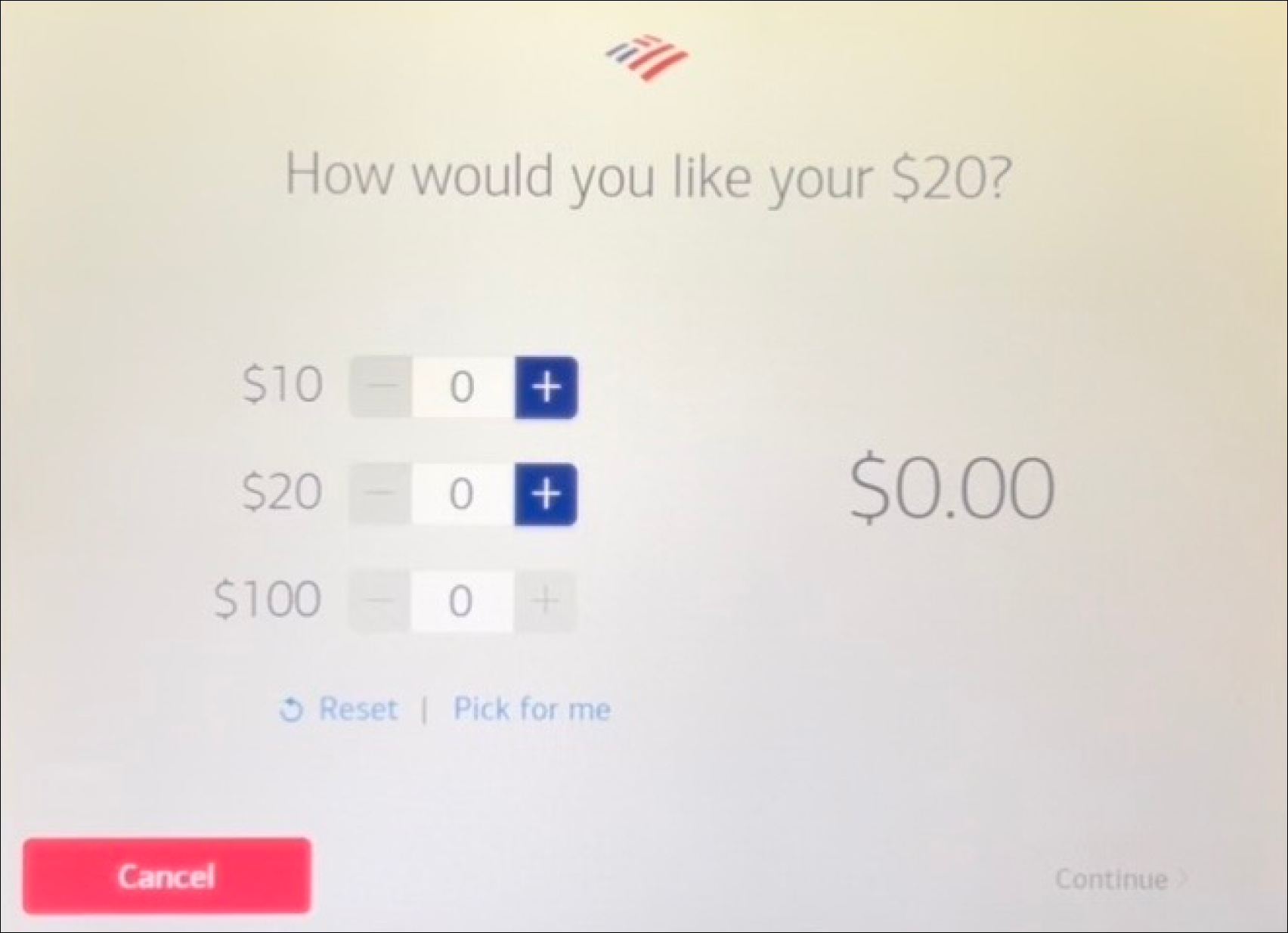 Bank of America. Sparse interface for the choose-your-bill screen. Selection buttons sit out of reach for most wheelchair users, but the total amount is prominent and clear, with a “Pick for me” autofill.
 Chase. A line-item total shows current vs. requested amount (e.g., “$0 of $20”). Denominations listed largest-first rather than smallest-first.
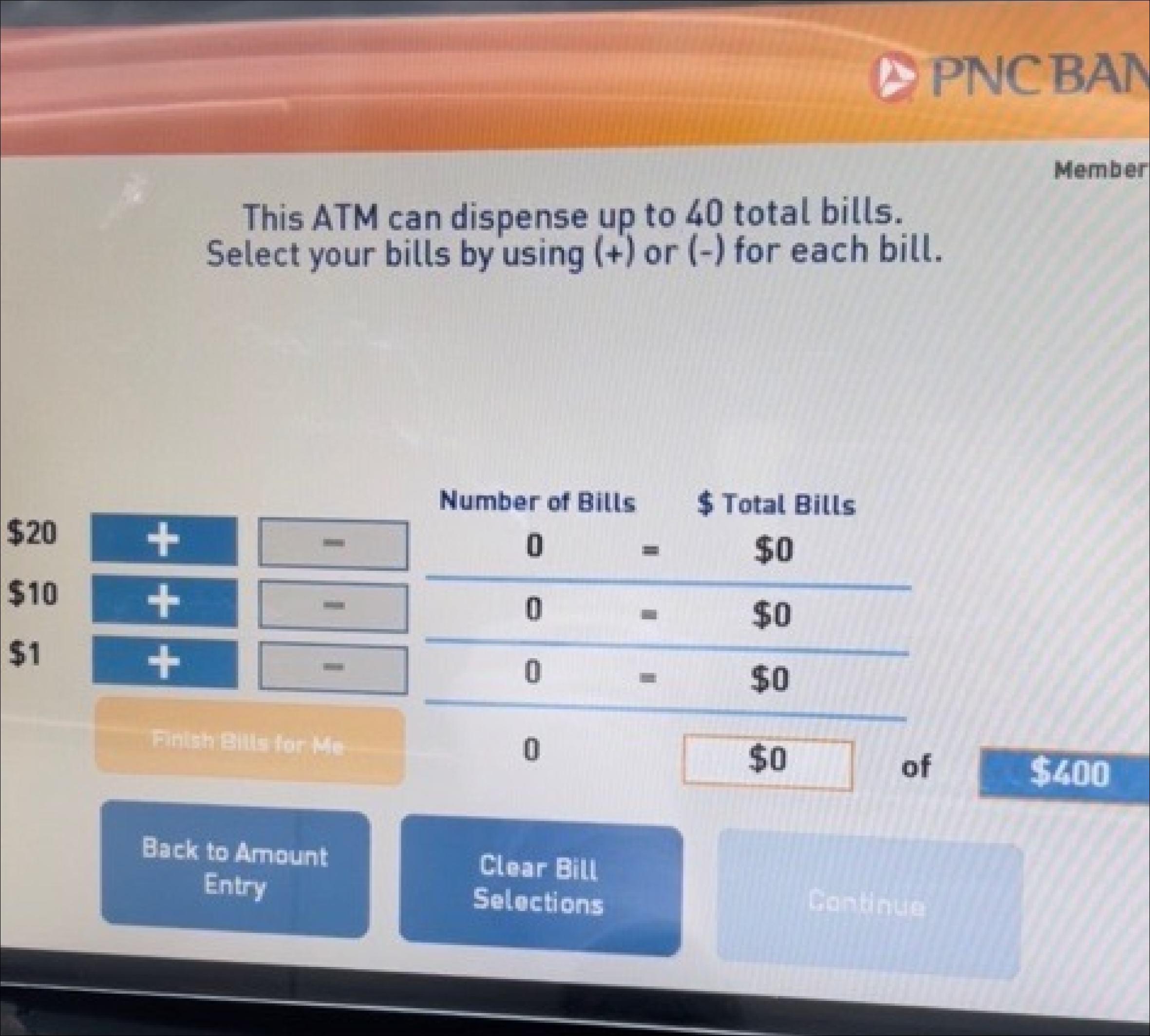 PNC Bank. Columns for “Number of Bills” and ”$ Total Bills,” aligned to show the relationship.
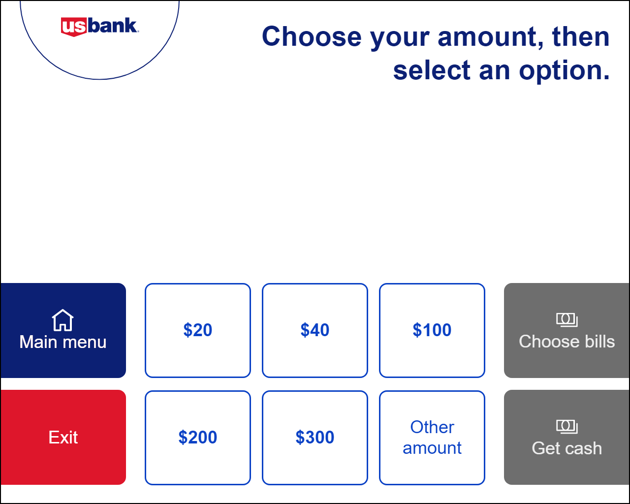
Choose an amount, simplified
The move was to collapse the two paths. No more “choose bills” vs. “get cash.” One screen with more preset denominations, and the bill-mix step pulled into its own dedicated flow only when the user wanted it.
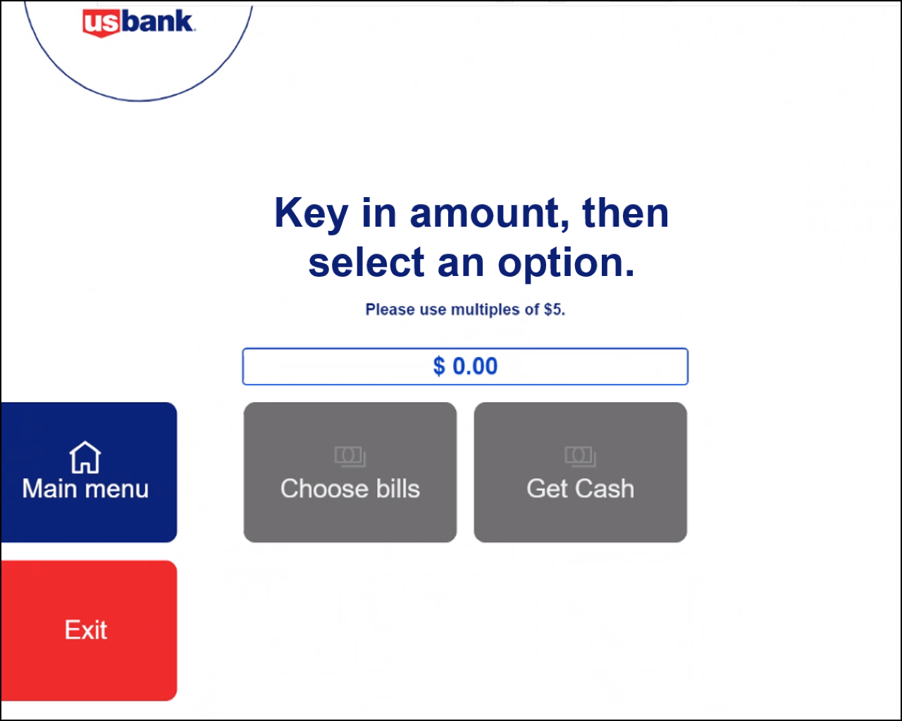
Other amount
With the choose-amount screen finalized, I took on the “Other amount” screen. The production version didn’t let users go back. They could submit or reset through Main menu, nothing in between. And with the flow moving away from two options, the forward path needed rewiring.
After review with the A11Y team, the “Clear” button was minimized and given an icon (so color wasn’t carrying the job alone). Buttons moved from center to right-aligned to signal forward motion. In the final pass, the “Use multiples of…” helper came back and the CTA changed from “Get cash” to “Enter.”
Bill mix
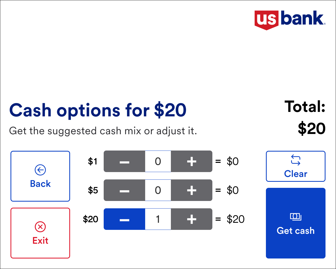
The primary question: what’s the best way to let users pick the bills they want?
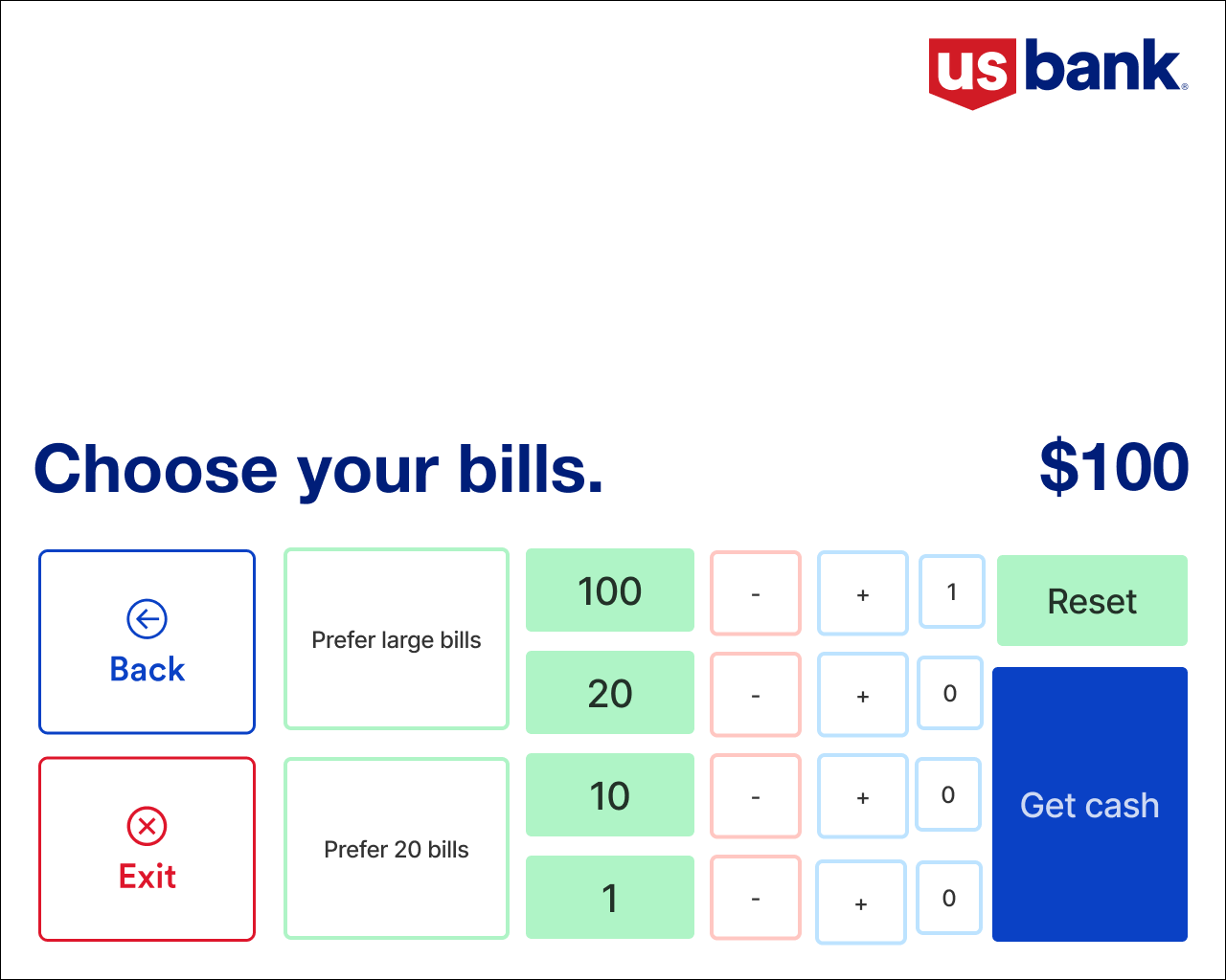
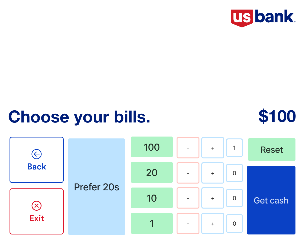
An early concept added buttons for “large bills” and “only $20.” That’s when I hit a hard constraint from the development team: Accessibility Mode can render only nine interactive elements on a screen. That constraint killed every “add one more option” solution.
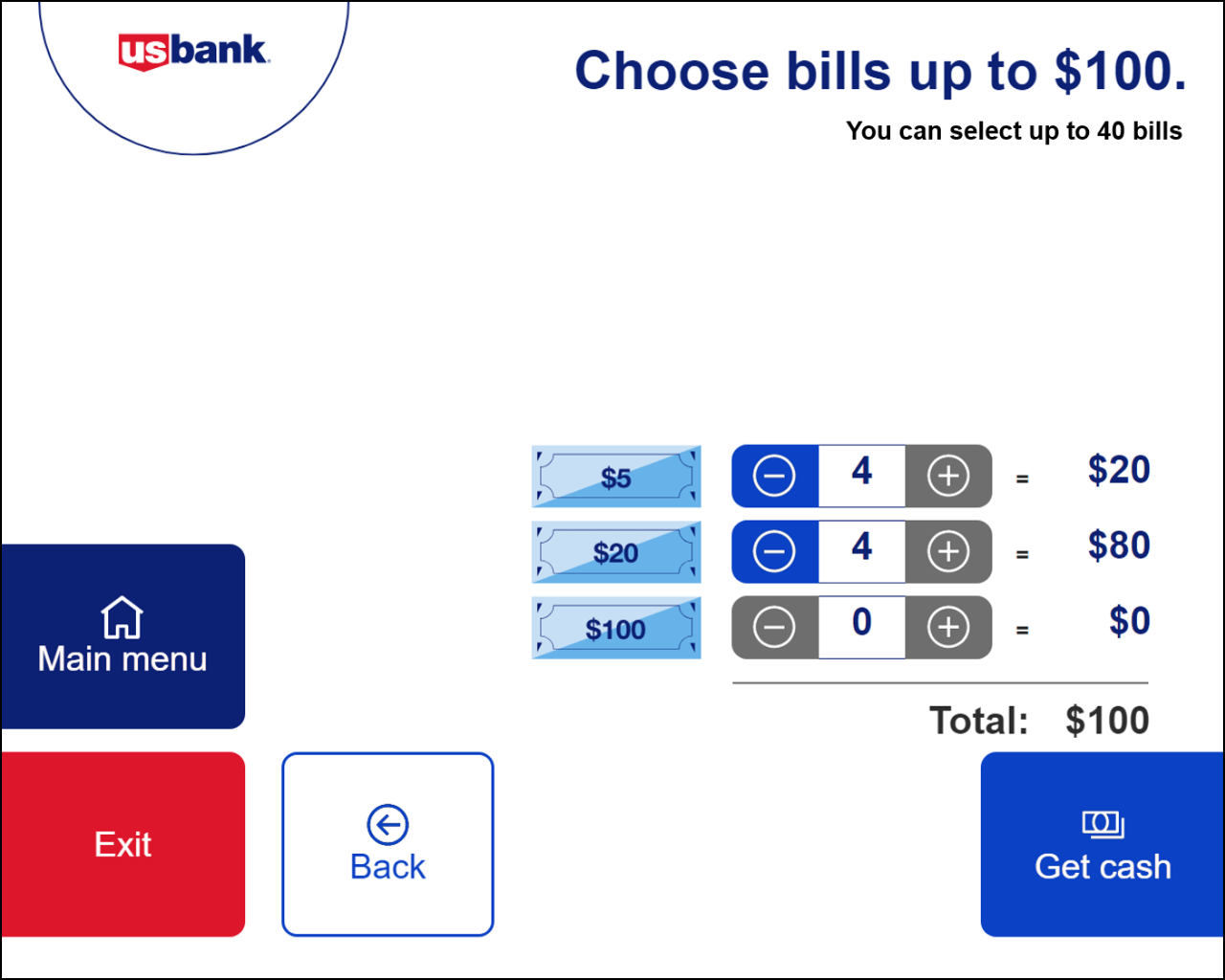
The answer came from the backend: auto-populate the most common bill denominations for any withdrawal amount, and let users adjust up or down from there. Plus/minus buttons were sized up after A11Y feedback for wheelchair accessibility.
Usability study
I built an interactive prototype and partnered with the research team on success criteria. Every task was rated on four dimensions (easy to use, easy to complete, speed, easy to understand) on a 1–5 scale.
Changing prepopulated bill denominations
Users found the adjustment easy overall. The pushback was specific: they expected the system to auto-rebalance. If you added a $5, they wanted the $20 count to drop automatically rather than having to subtract it manually.
“It was quick and not complicated at all.”
“I think it should auto-adjust. So, I choose 1 increment of $5, the $20 should clear. I had to manually reduce the $20 count.”
What I took from it
The constraint that looked like a limit (nine interactive elements in accessibility mode) turned out to be the design brief. It pushed the flow toward a single simpler path instead of a menu of escape hatches, which ended up faster for everyone. The design went to pilot and is scheduled for a national launch in Q1 2025. The next step is testing an open-ended withdrawal, where users enter whatever amount they want up to their daily limit without preselecting.