A team of nine built Copper+Crane. I led IA, site planning, and wireframes. As the project evolved, my focus moved to the email system: keeping transactional and marketing emails cohesive with the final site design.
The problem
Georgia-Pacific, a leader in consumer goods, wanted to expand beyond its typical market (paper towels, toilet paper, plates, cups) into luxury products sold direct-to-consumer. The challenge: GP had never sold directly. It always partnered with retailers who owned the customer data.
Gaining direct consumer insights was strategically important, but GP had to walk a fine line. Retailer relationships with Amazon, Walmart, and others were core to the business model. Launching a direct brand could jeopardize them. So GP created an entity called Digital Roadmaps to distribute Copper+Crane. We had to launch a product from a major brand without referencing the relationship to that brand.

Maximizing resources
Few financial resources were allocated for the project, and the timeline from inception to e-commerce launch was three months. The team had to get resourceful. No one could dedicate 100% of their time since this wasn’t initially a revenue-driving initiative, so we worked in stages to execute within the timeframe.
Users and audience
Internally, the innovation brand managers were our main clients. Their goal was to validate that GP could sell direct with minimal investment and resources.
For end users, we targeted women in their mid-30s to 50s: suburban, $120,000+ household income, college-educated, adventurous travelers who enjoyed new experiences and wanted to recreate the spa at home.

The process
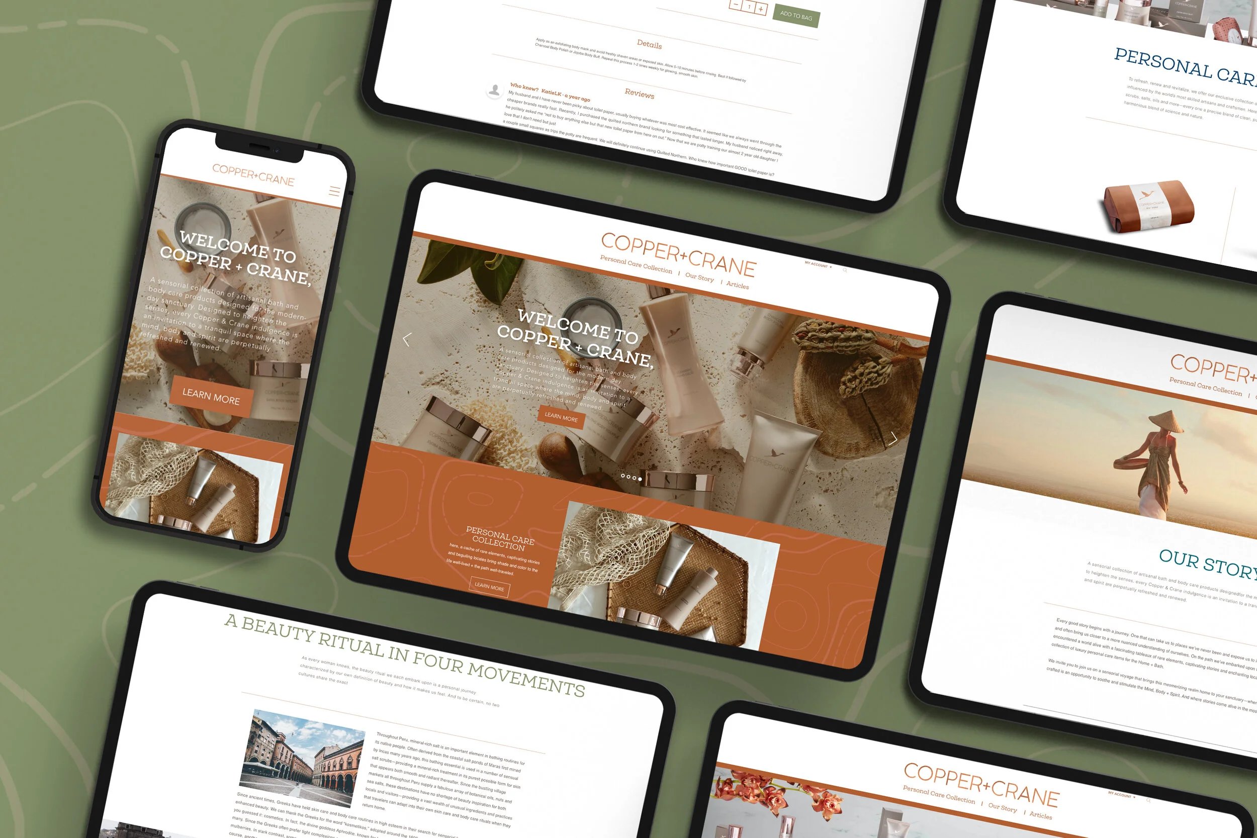
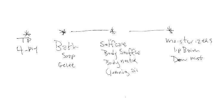
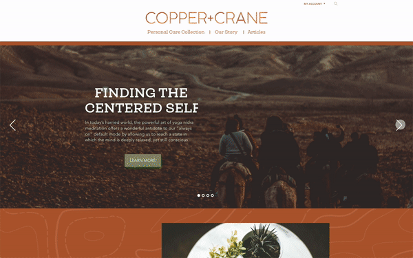
The initial idea for Copper+Crane was based around a four-ply luxury toilet paper. Over time the line grew beyond paper to soaps, moisturizers, candles, diffusers, and aromatherapy. With that expansion came a need to identify and categorize how products should be grouped for the most efficient browse.
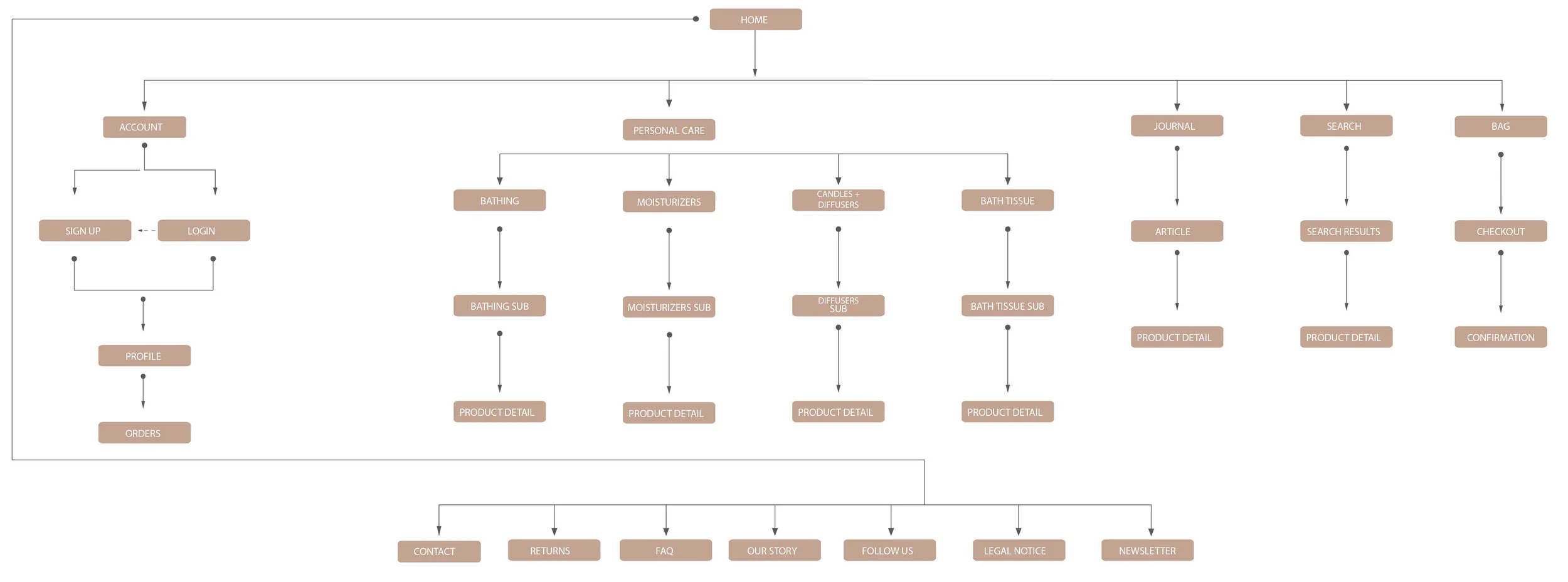
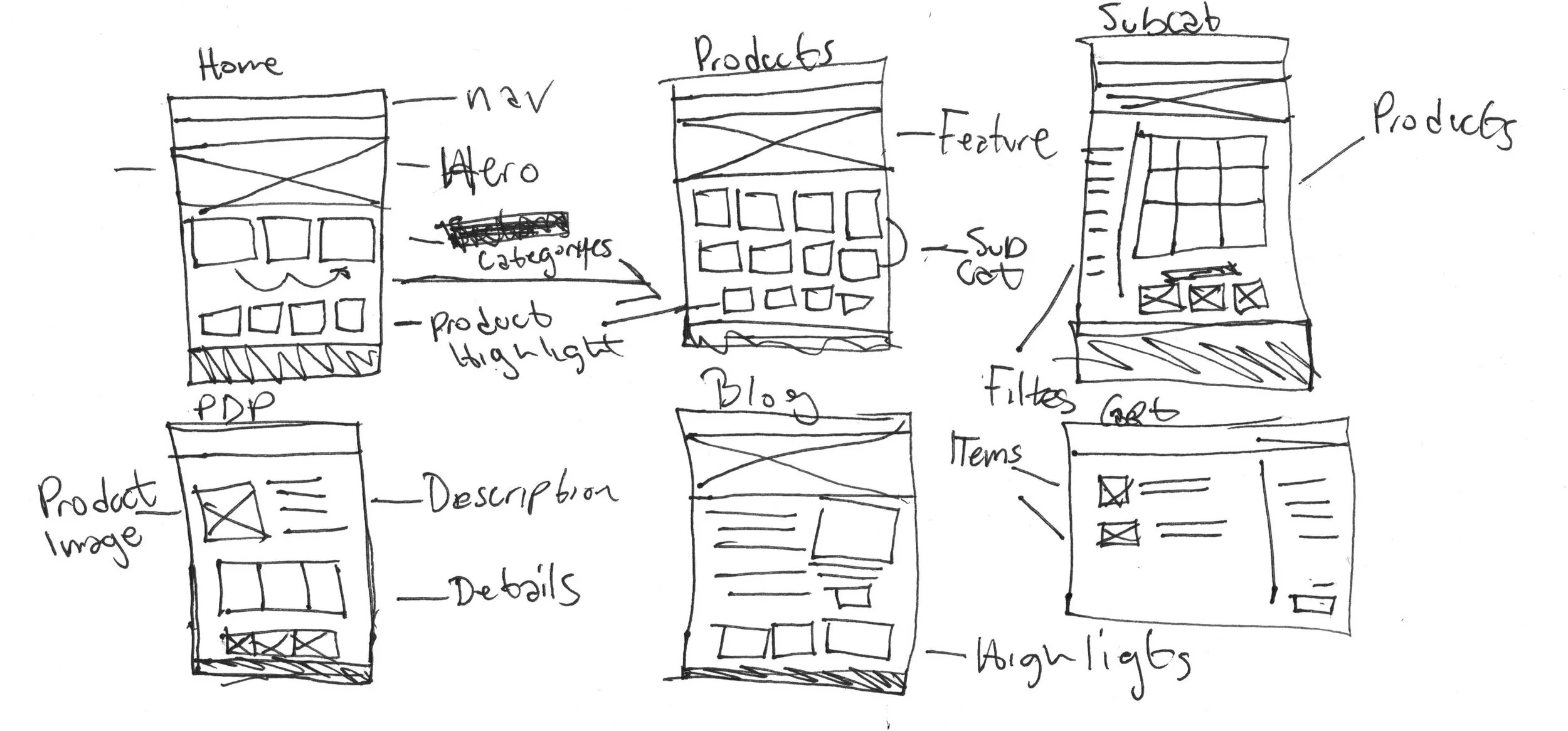
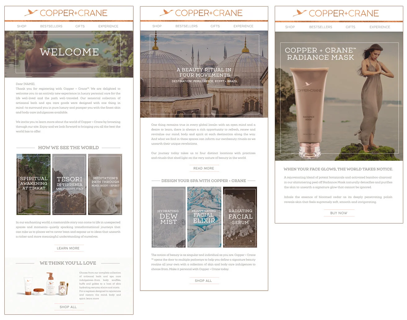
While content was finalized, I researched luxury brands from a UI standpoint. From that research and information provided by brand managers, I built rough wireframes.
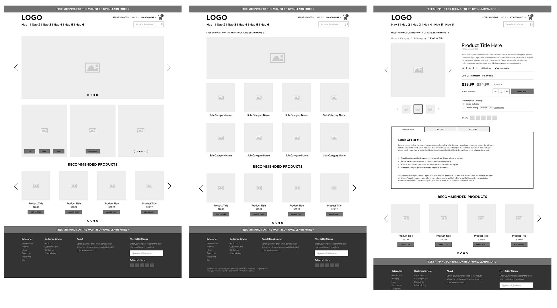
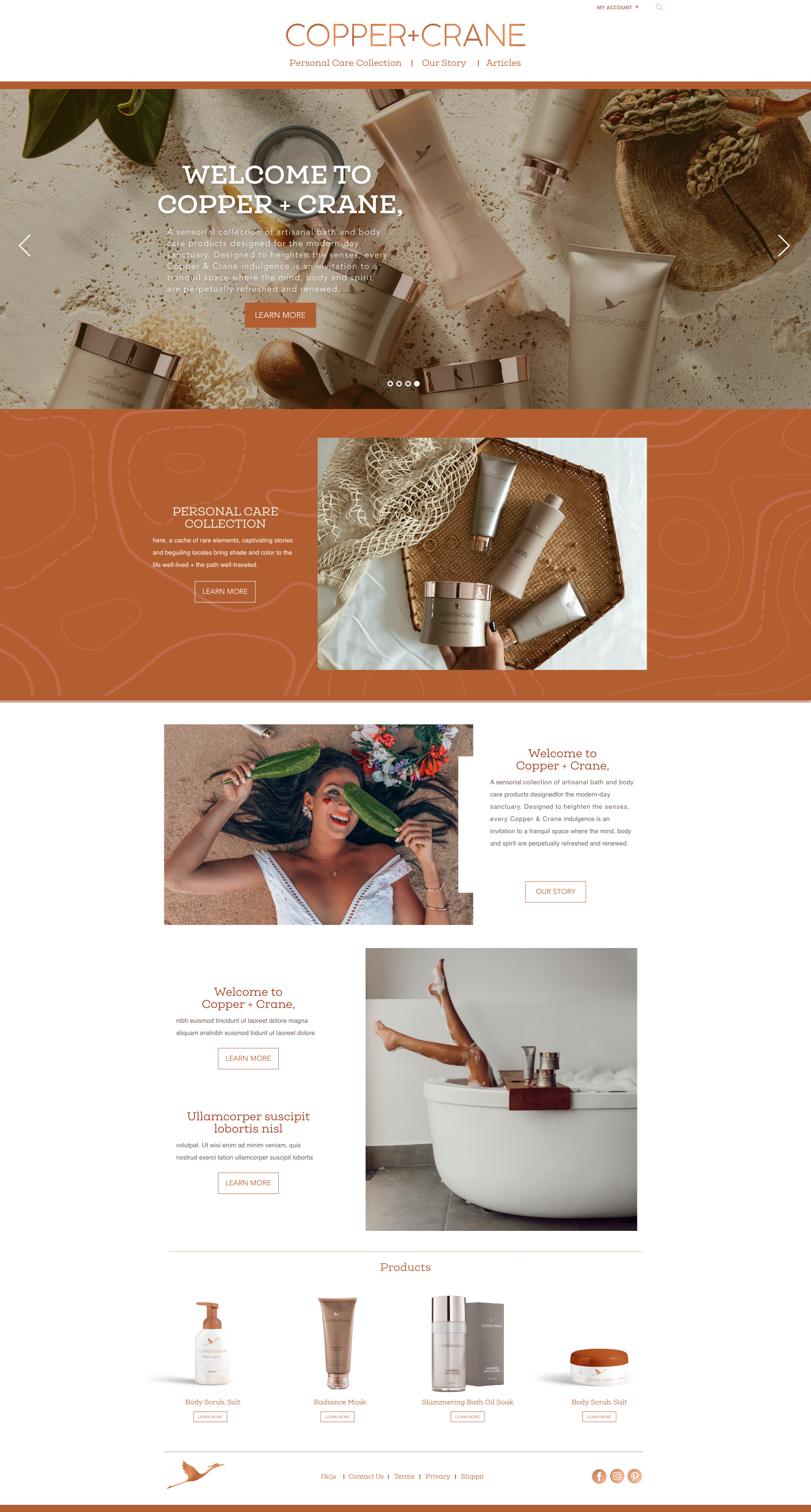
Once the UI direction was set, I built a high-fidelity interactive prototype against the selected design system to test the flows end-to-end.
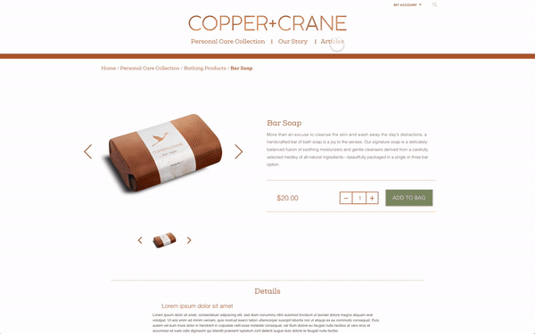
The last piece of my contribution was the email system (transactional and marketing), which reused content and visual treatment from the site so the customer’s first order confirmation and first marketing touch felt like the same brand.
The learnings
The products launched. It proved the internal design team could ship an end-to-end solution in a product market that wasn’t core to Georgia-Pacific’s business, on a very short timeline and budget. Selling direct-to-consumer was such a success that it was rolled out to all of GP’s core consumer brands.
Copper+Crane itself was retired. It couldn’t garner a wide enough audience to keep receiving company support. I think the brand could have been more successful with a smaller initial product launch to build recognition first; the offerings were too vast at the onset, which made it hard to reach the target consumers. And launching as an explicit GP subsidiary could have opened more market penetration.