I took the assets and preliminary versions already created, completed the website, and designed storyboards for a supporting social post.
The problem
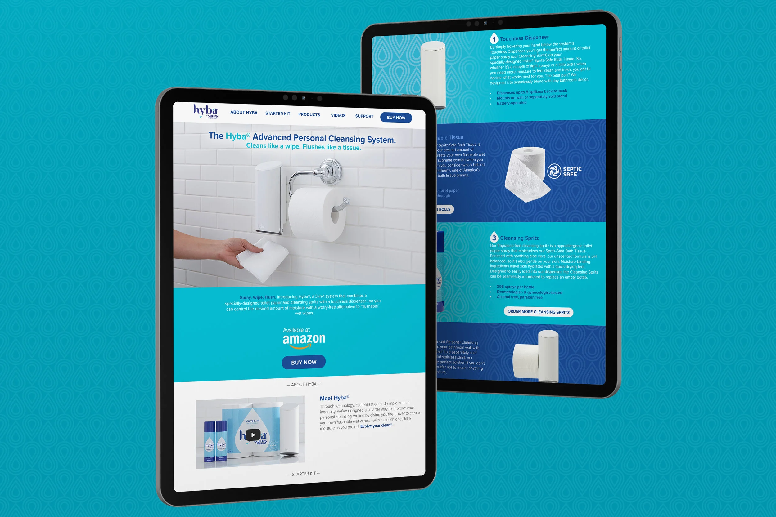
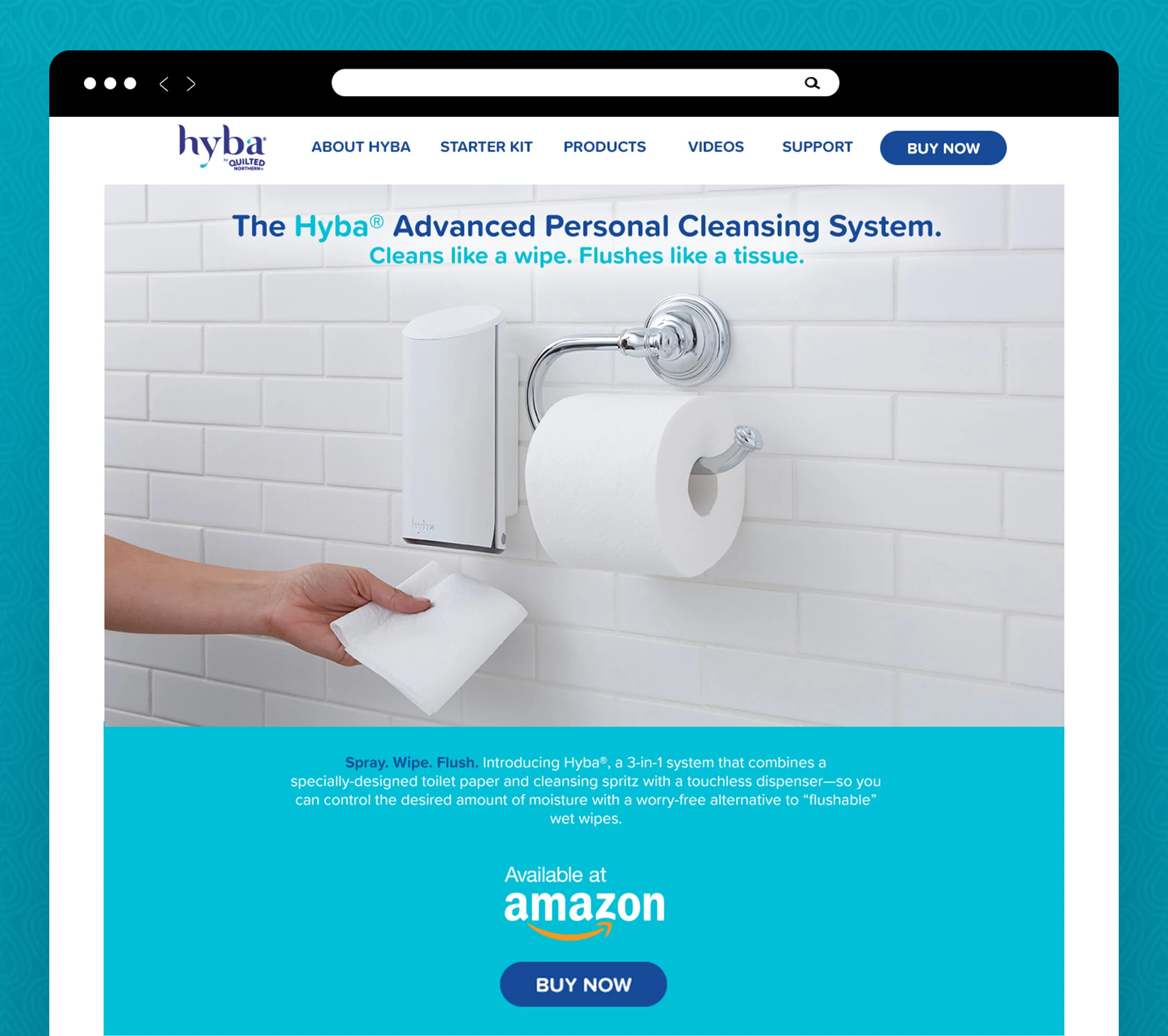
Many consumers prefer wipes as their cleaning method, but most wipes aren’t septic-safe and can clog pipes, causing major plumbing issues. Hyba is a solution to that problem, but it’s an unknown product type with a new brand name. A website was needed to explain the system and its benefits.
Target audience: consumers under 50, open to innovation, seeking a product that matches their personality, willing to pay more for higher quality.
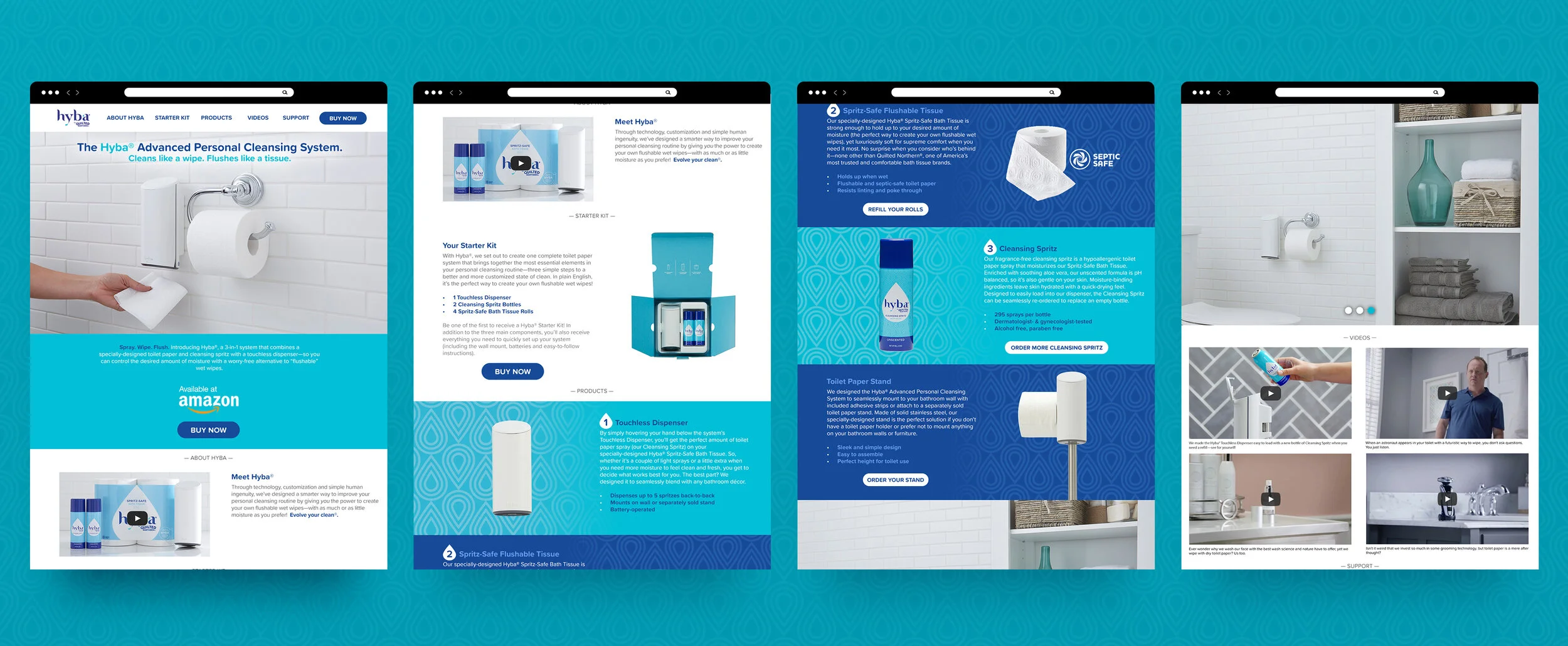
Mandate: keep the website simple. Ensure the product description and benefits are clearly visible above the fold. Use different bathroom environments to demonstrate the flexibility of the cleaning system.
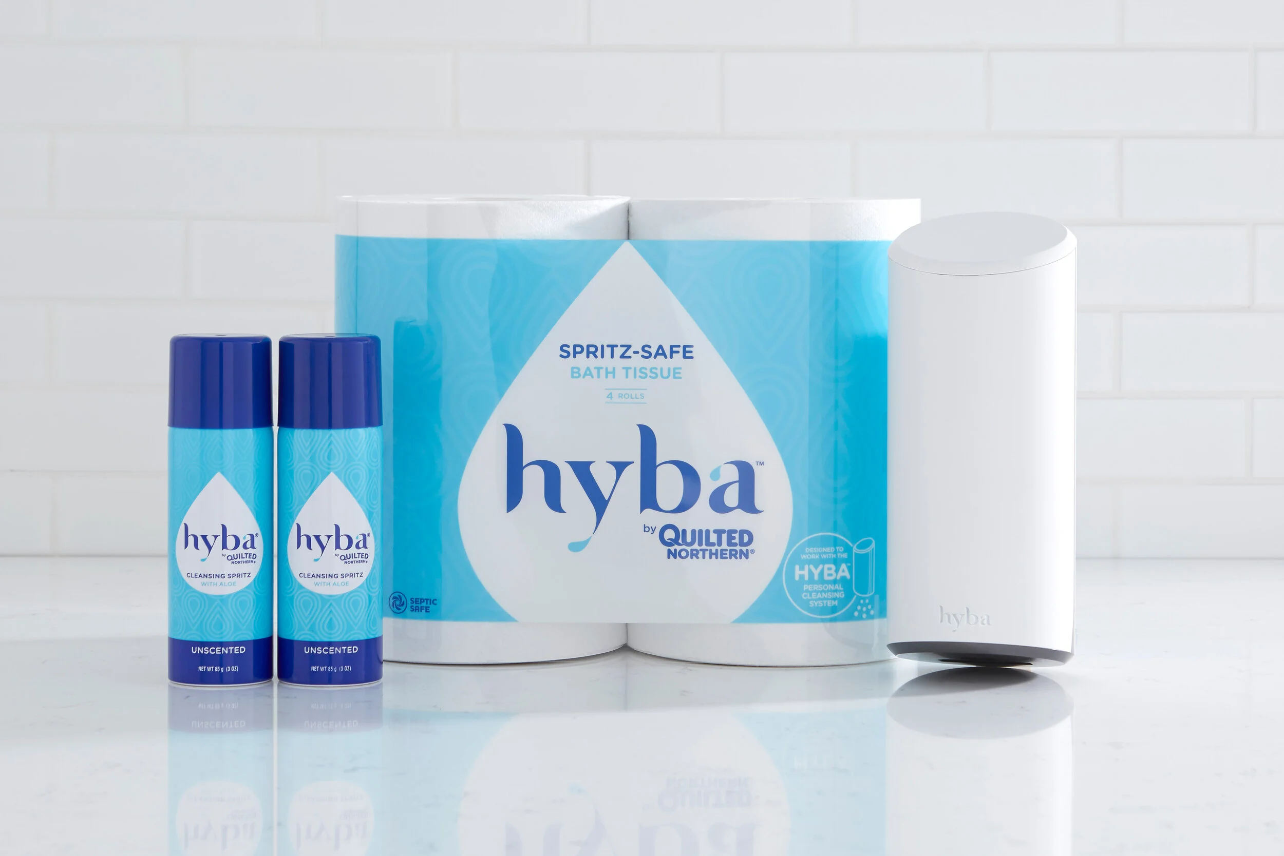
Image credit: Ashley French.
The process
The design stayed simple and direct, using a water-drop motif to add texture and differentiate sections while showcasing the product and its benefits.
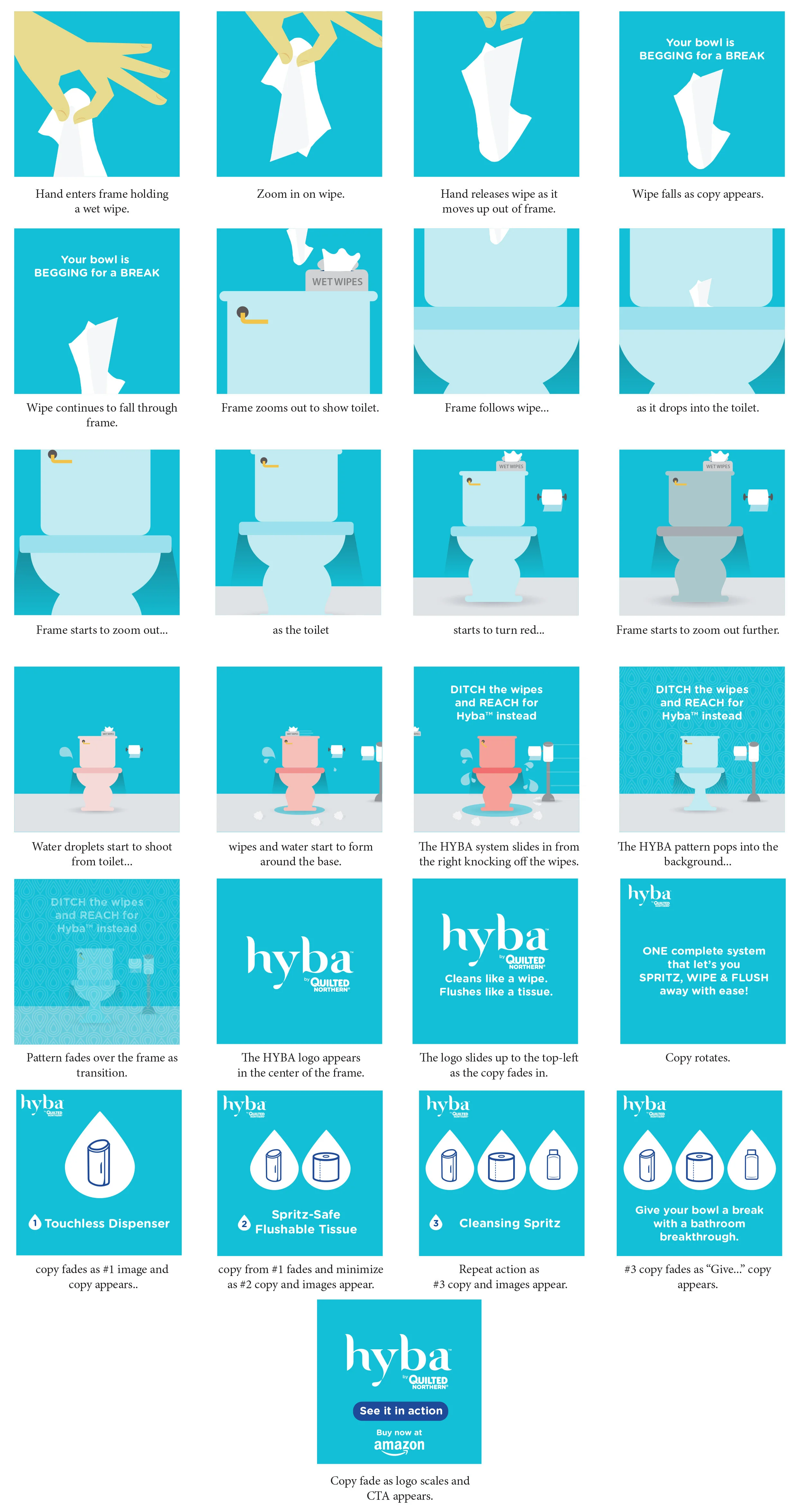
Another aspect of the project was a set of storyboards for an animated social post. Hyba had limited content early on; while more was being produced, animated posts were a way to communicate benefits.
The learnings
The web and branding received high internal acclaim. Hyba was an early foray into physical products for a paper company. The product itself saw marginal success but lost distribution on Amazon, which slowed growth. There were two revisions of the product and website before it was ultimately shelved. A good learning experience in seeing the intricacies of creating a physical product and finding an audience for it.